Case Study · Brand Identity
Portals Brand & Visual Identity
A product brand for a creative workspace. One mark, one system, and every surface that carries it, from the dock icon to social.
My role
Tools
Portals is a creative workspace where ideas become frames, builds and films. The brand had to feel like the product: a tool for making things, not a corporate wrapper around one.
The work starts with a single mark and grows into a full system. Colour, type, layout rules and product surfaces that all answer to the same logic.
Below are the definitions, the typography, the app surfaces and the social templates that carry the identity beyond the screen.
01 · The System
One mark, a whole system
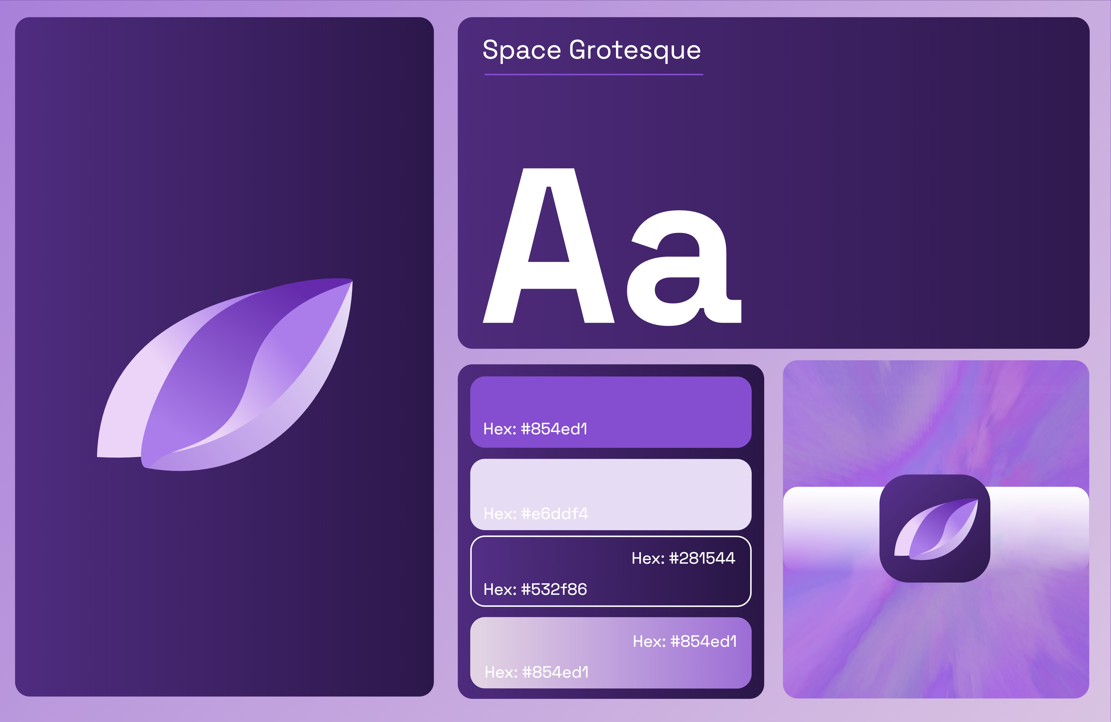
The bento shows the identity as one system: the mark, the colour logic and the graphic shapes working together across every surface.

02 · Definitions
The rules that keep it coherent
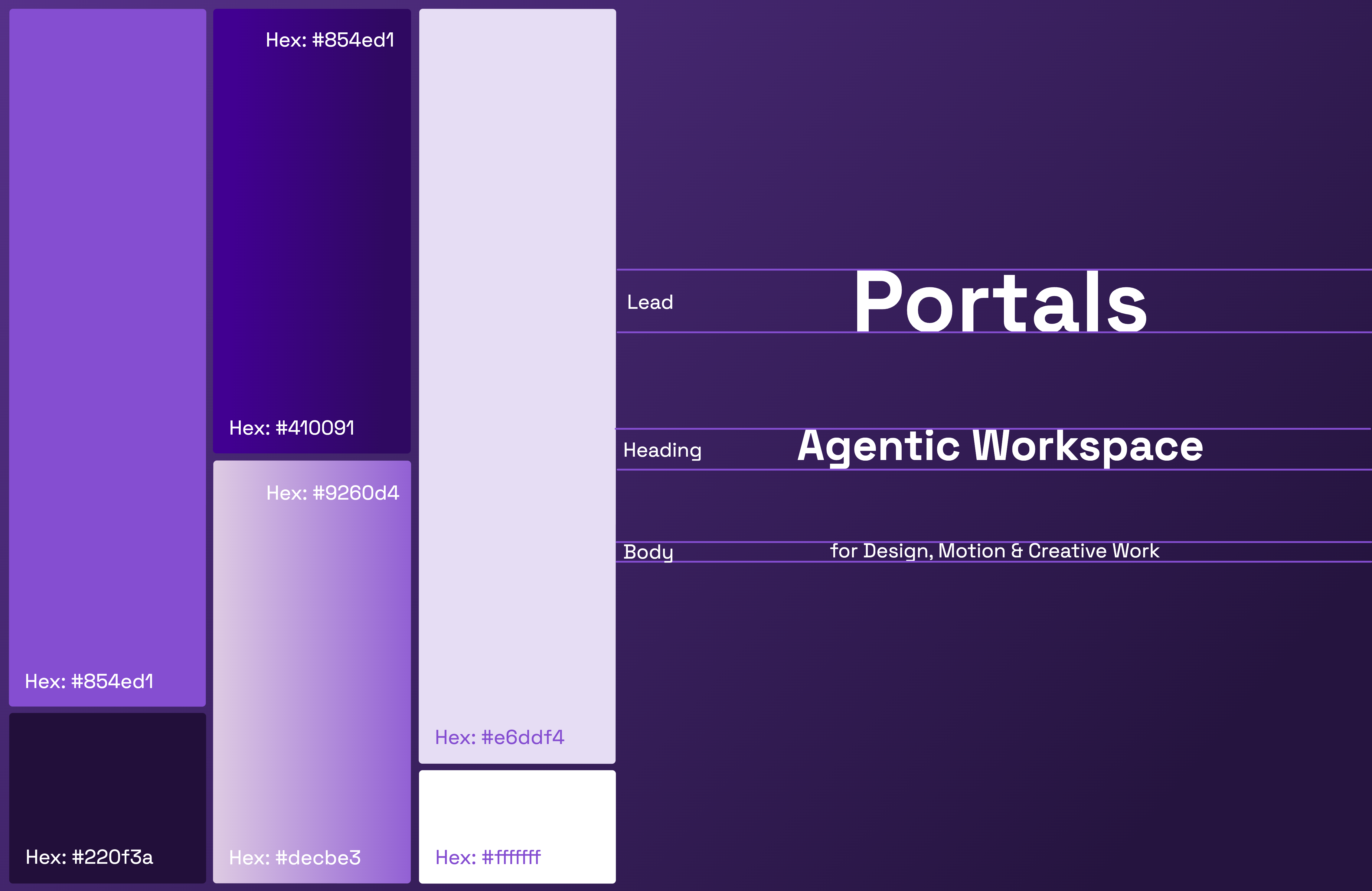
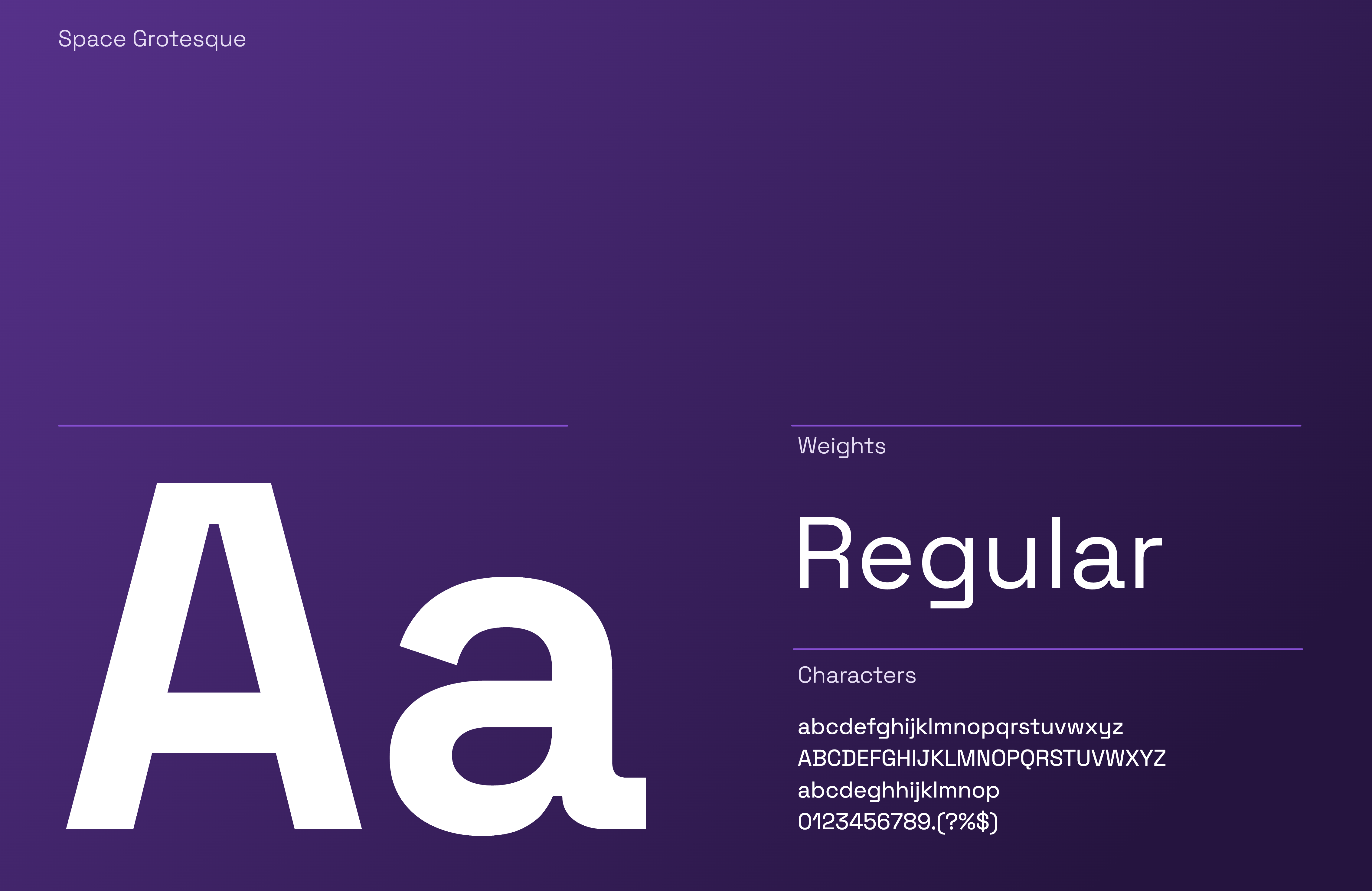
Brand definitions and typography lock the system down, so every screen and every post answers to the same language.
03 · Surfaces
From dock icon to product
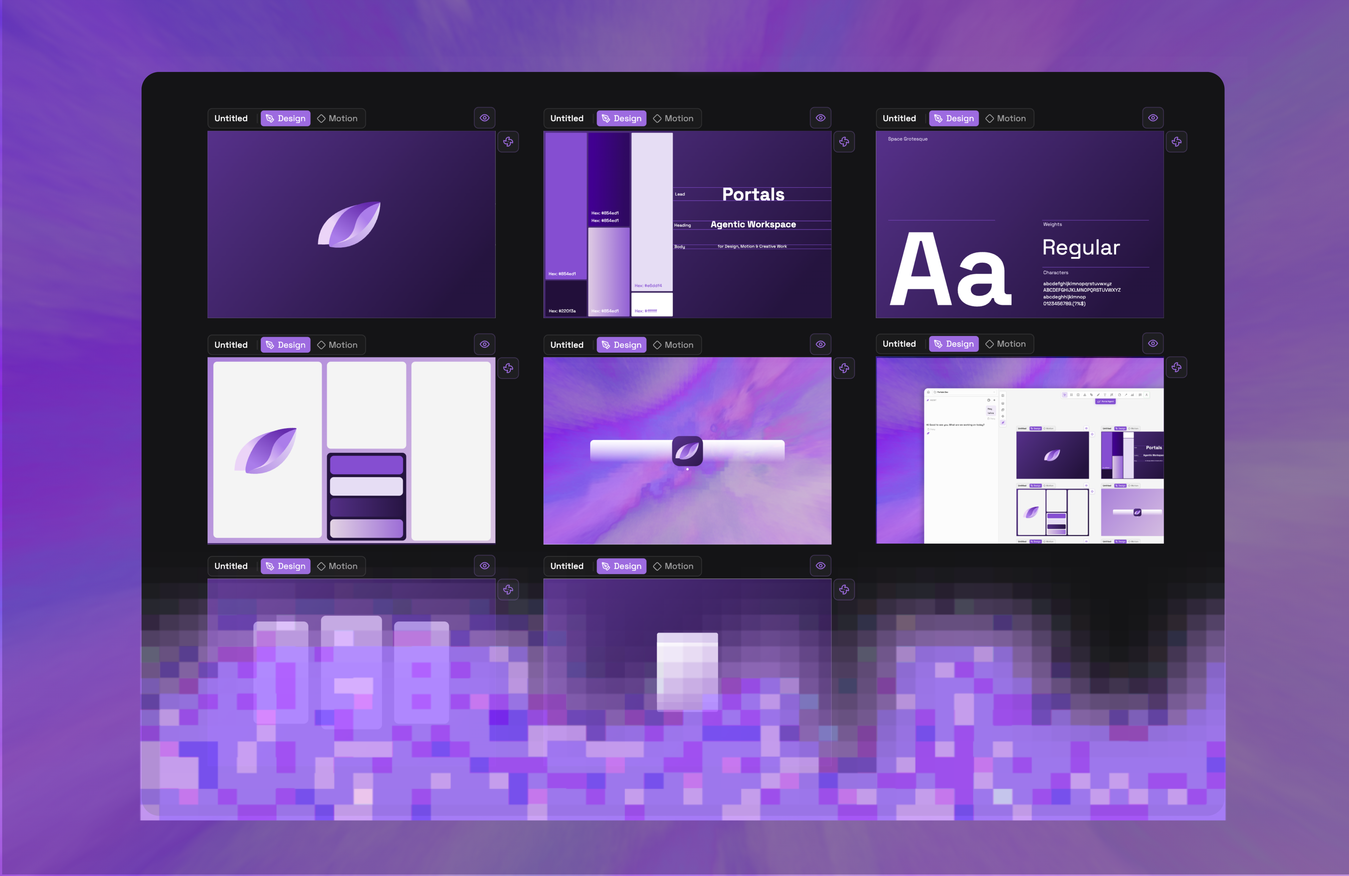
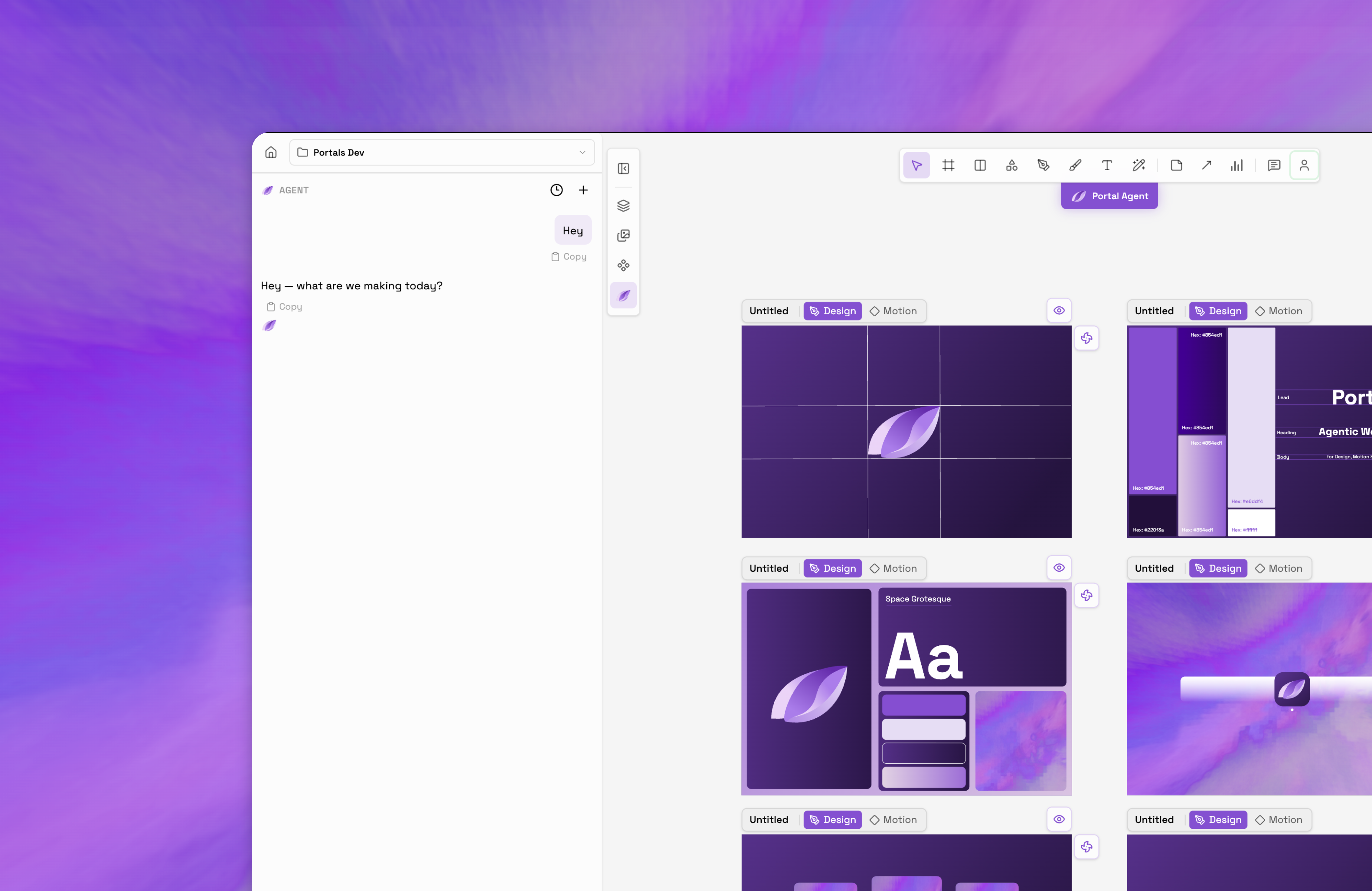
The identity lives in the product: the app, the dock and the screens users touch every day.

04 · Social
The brand, out in the world
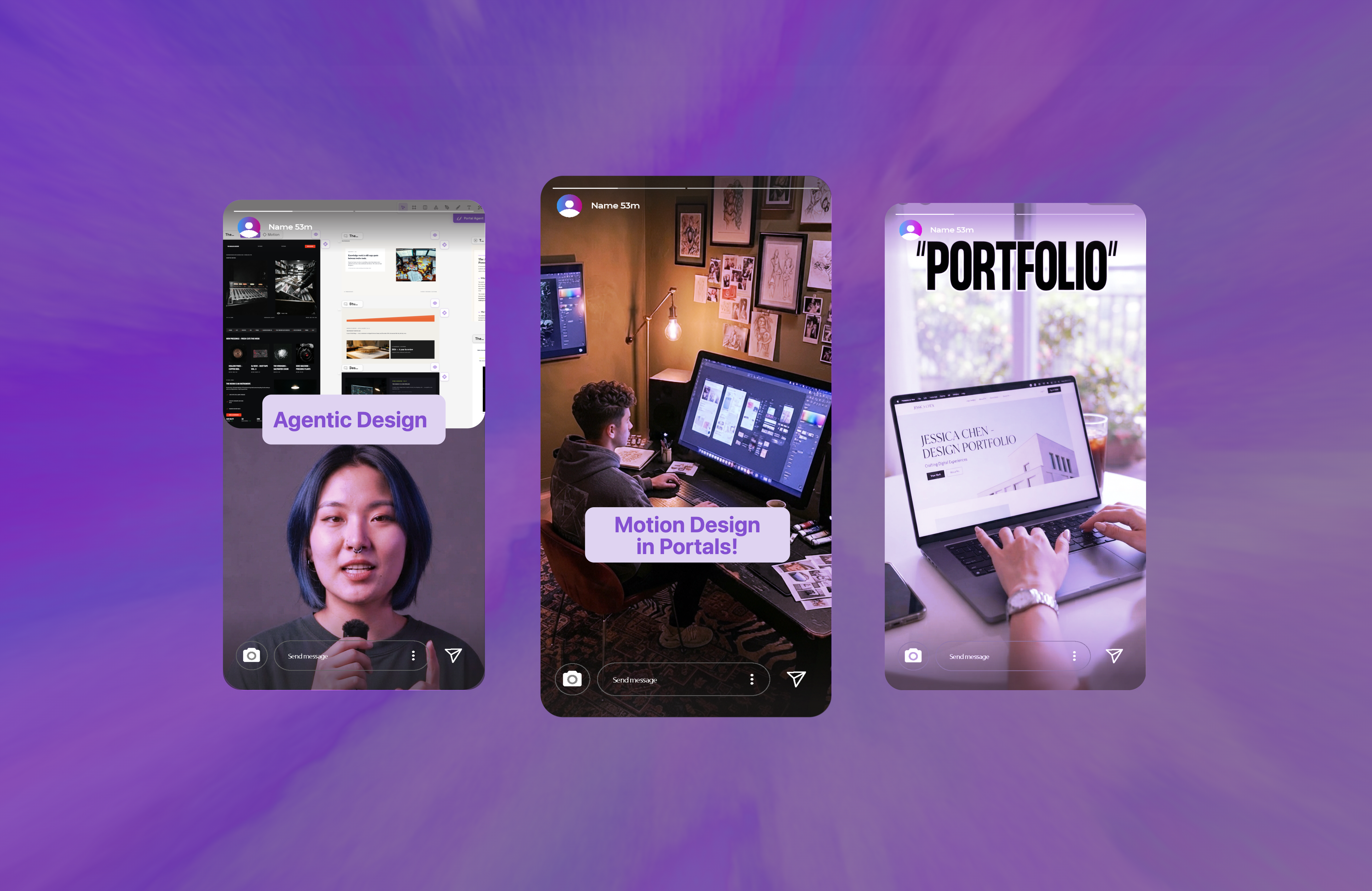
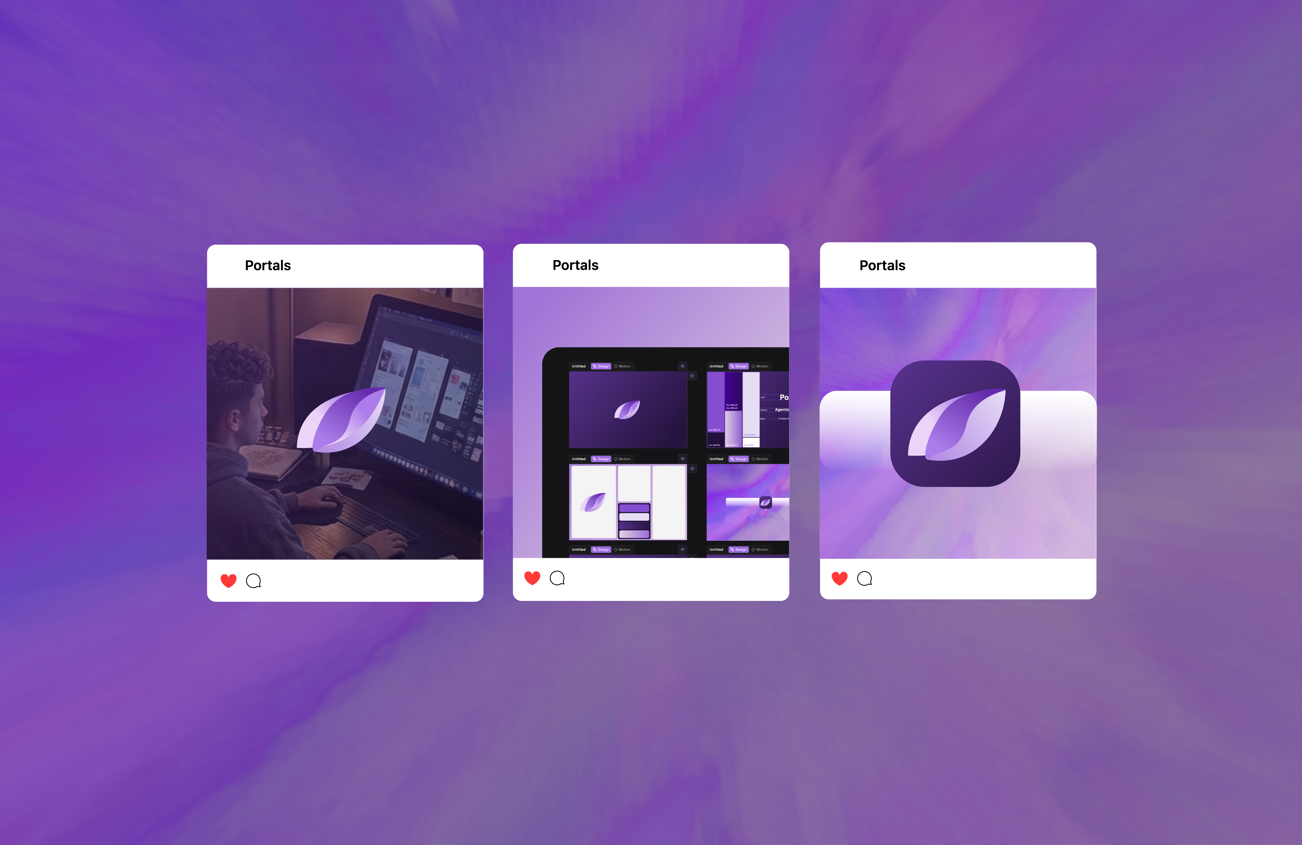
Templates that keep the identity consistent across social, without a designer in the loop every time.