Case Study · Branding & Visual Design
Pear Diagnostics
A full brand and website for Pear Diagnostics — identity, stationery and a clean web presence.
My role
Tools
Pear Diagnostics came as a complete brand build: the logo and colour system, the typography, the stationery, the style guide — and a website that carries the identity into the product.
The work balances a clean, credible healthcare look with a distinctive identity that feels modern and confident.
Below is the brand end to end — identity, stationery and the web surfaces that carry it.
01 · Identity
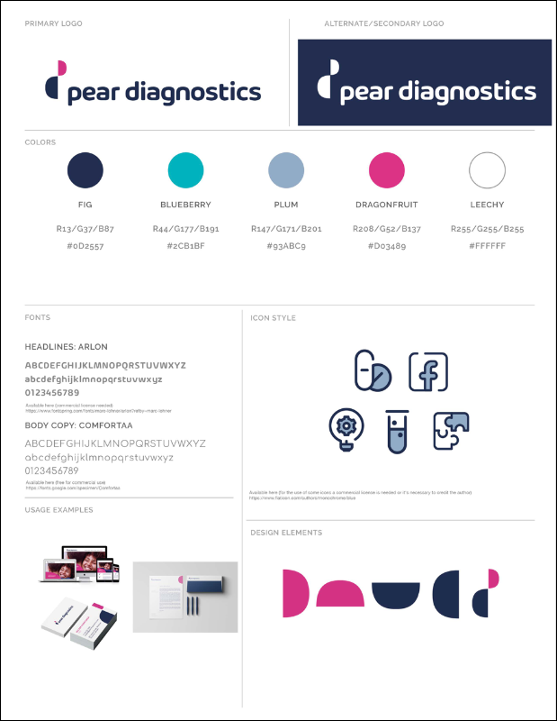
The mark and the colour
The logo and the colour system that anchor the whole brand.


02 · Typography
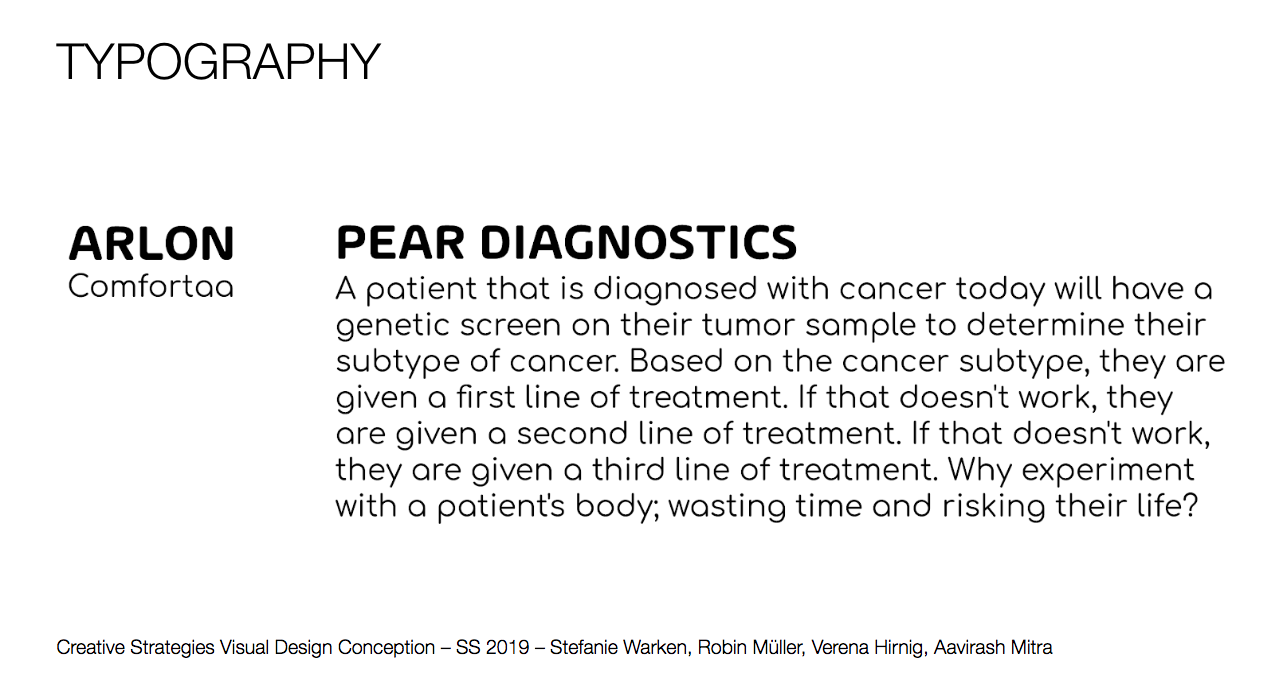
The type language
A clean type system that keeps the brand credible and consistent.
03 · Stationery
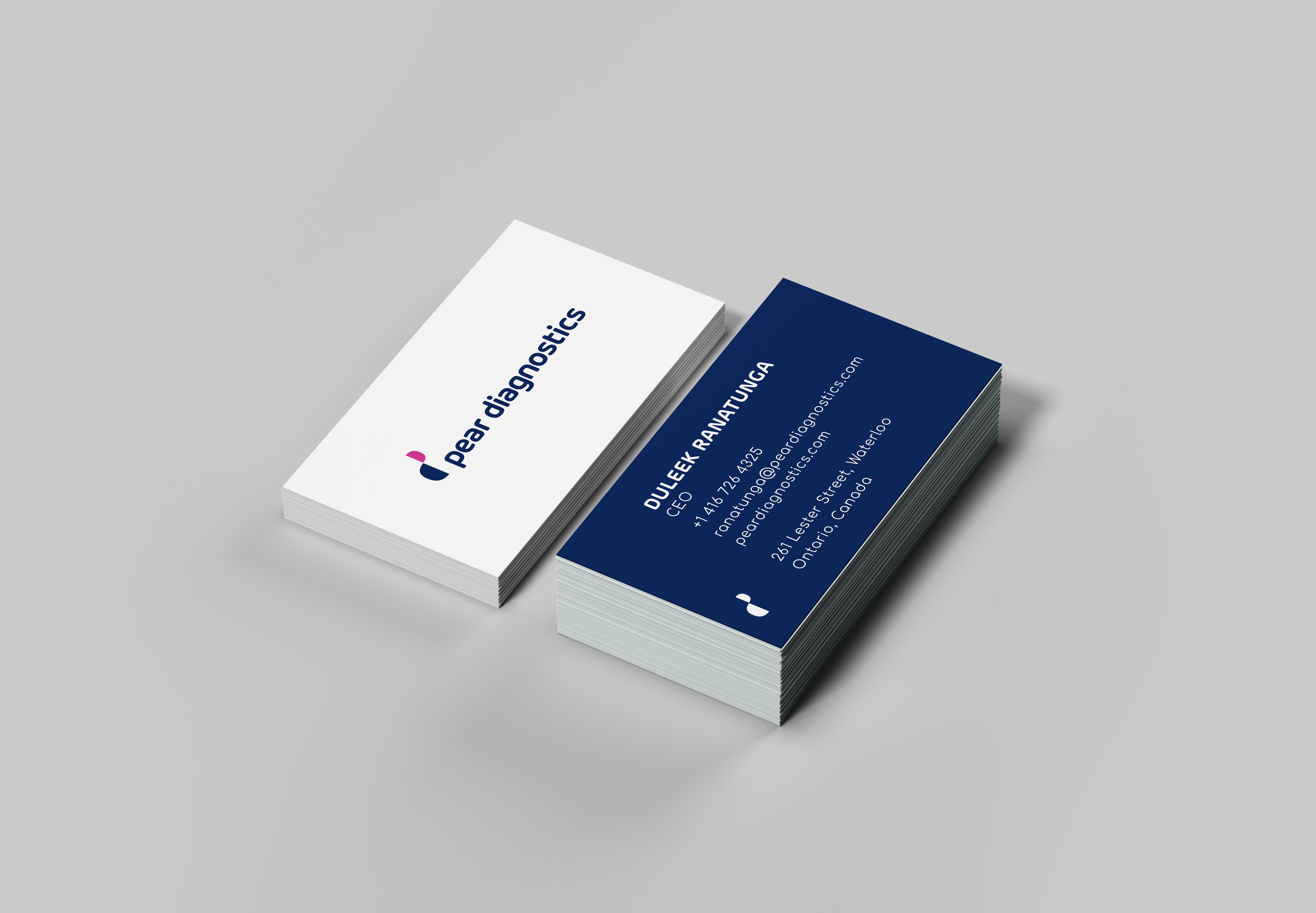
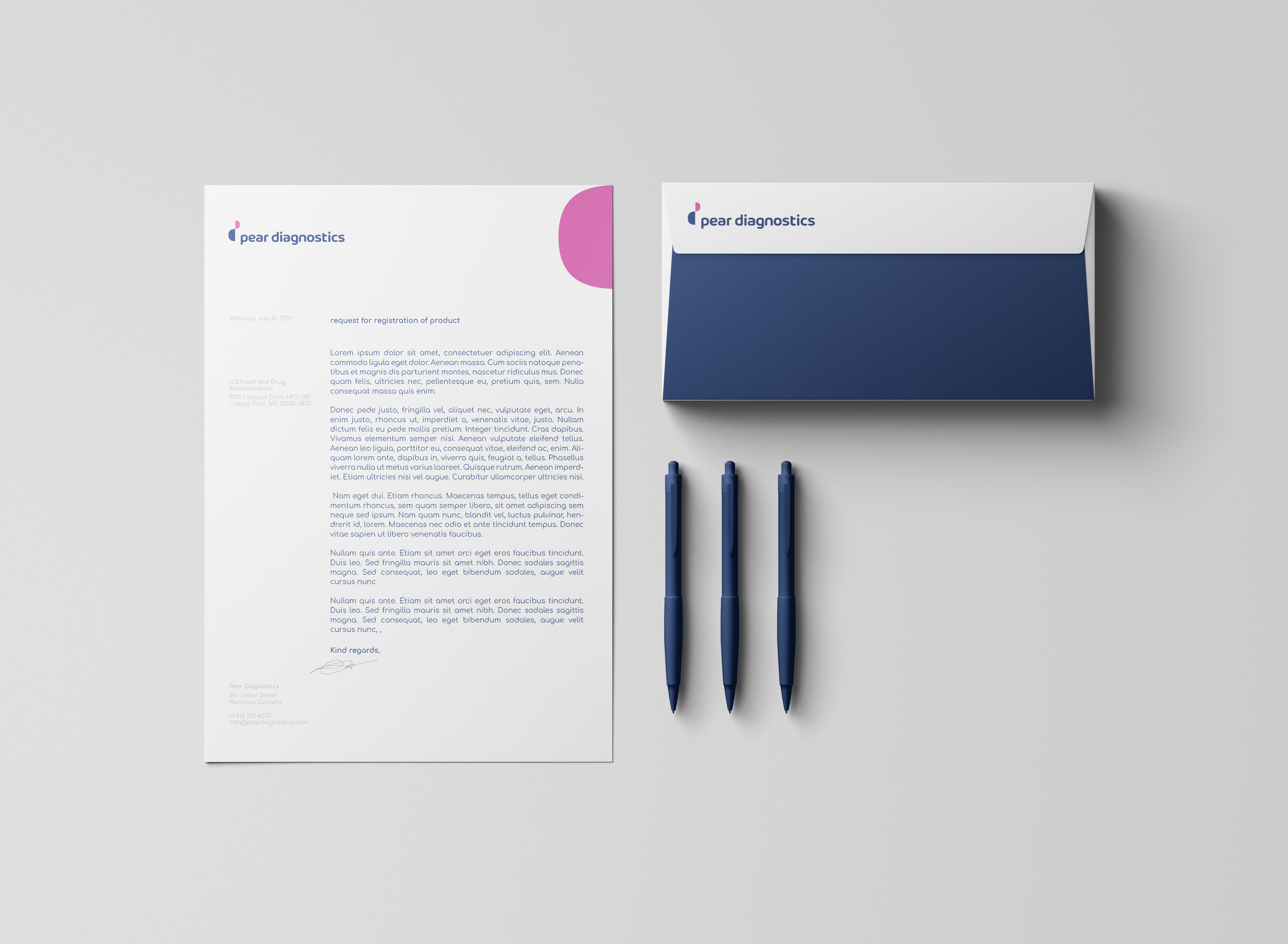
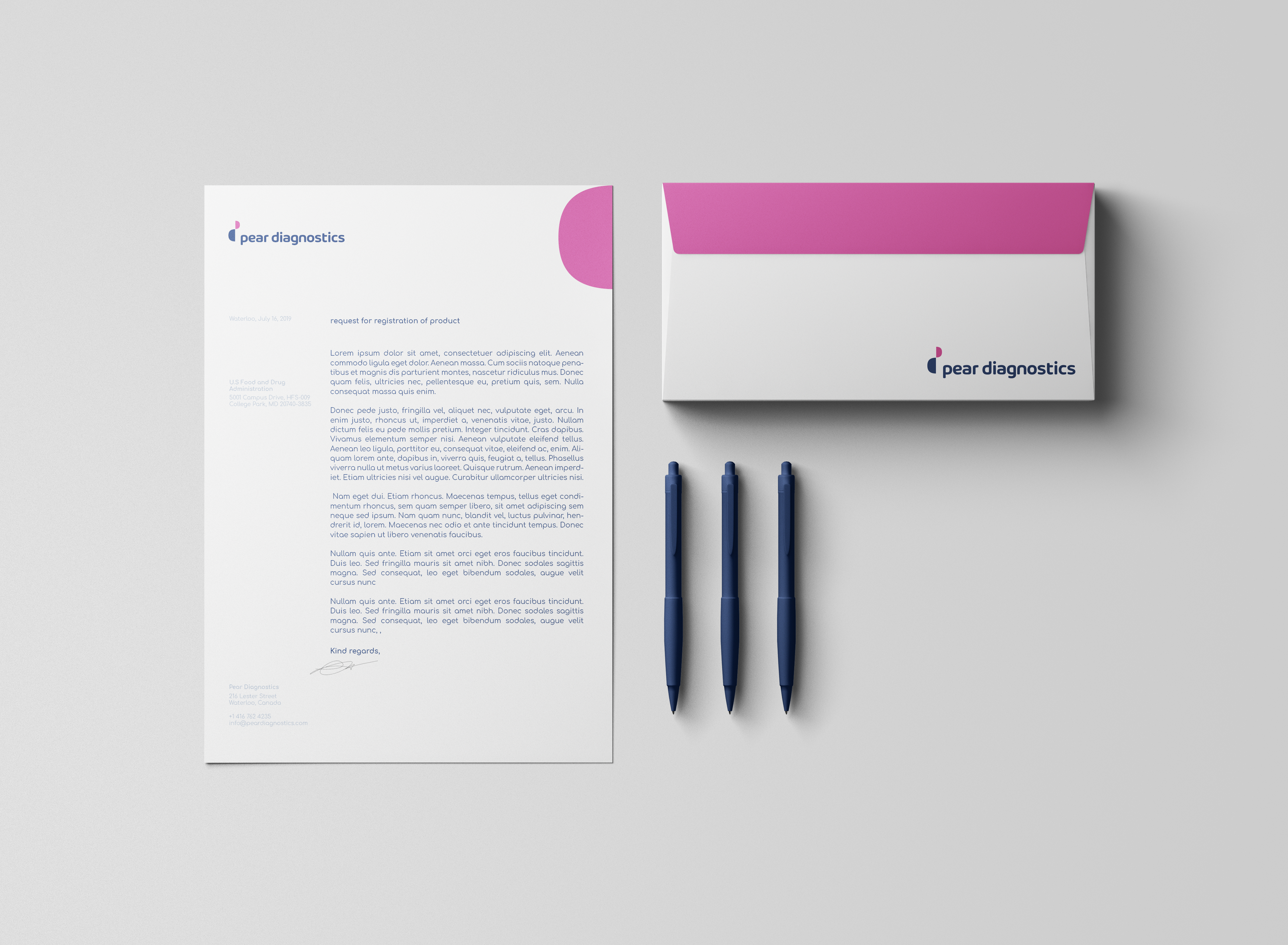
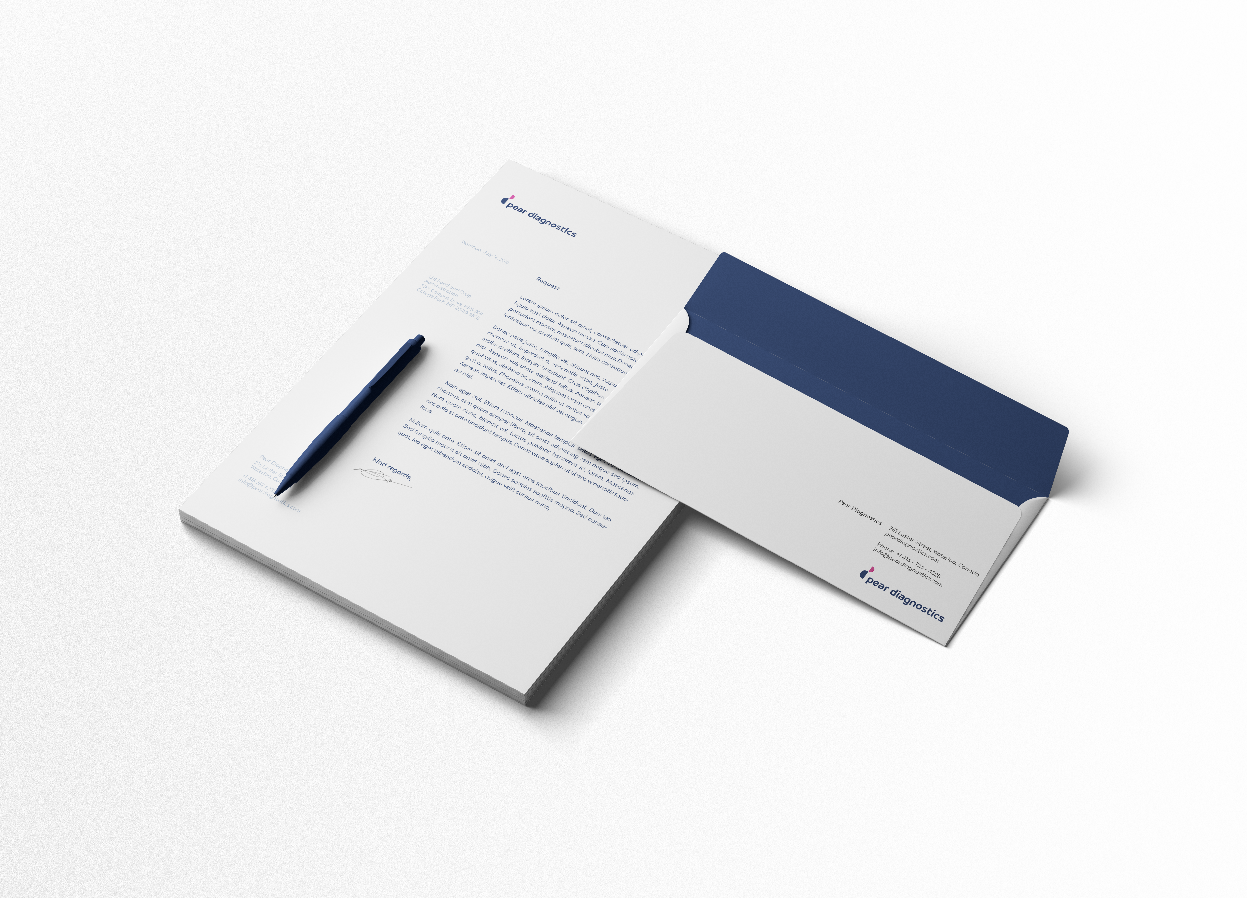
The brand in hand
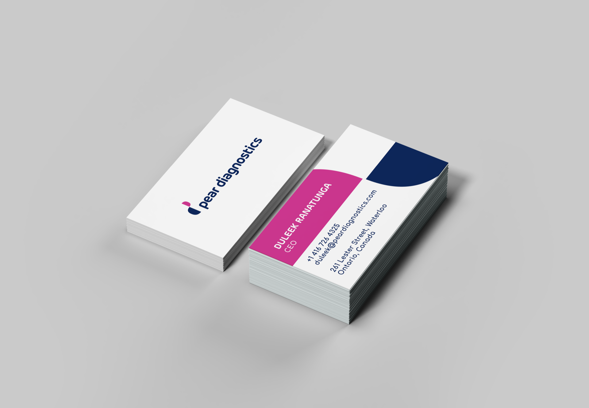
Business cards and letterheads carrying the identity into print.
04 · The Brand
Mockups and the style guide
The branding mockup and the style guide that keep the system consistent.
05 · The Website
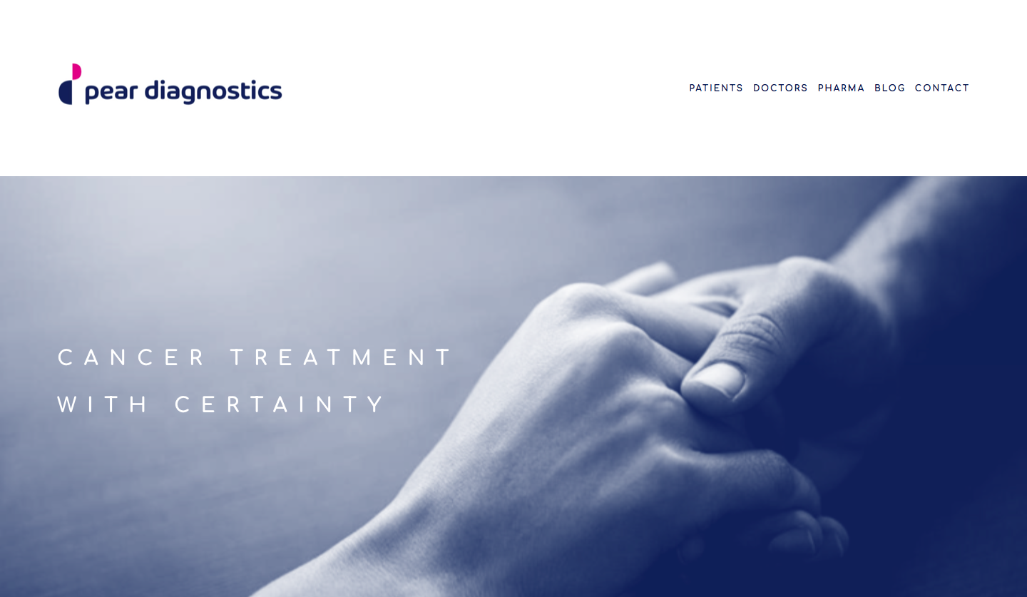
The brand where it lives
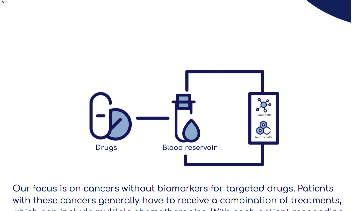
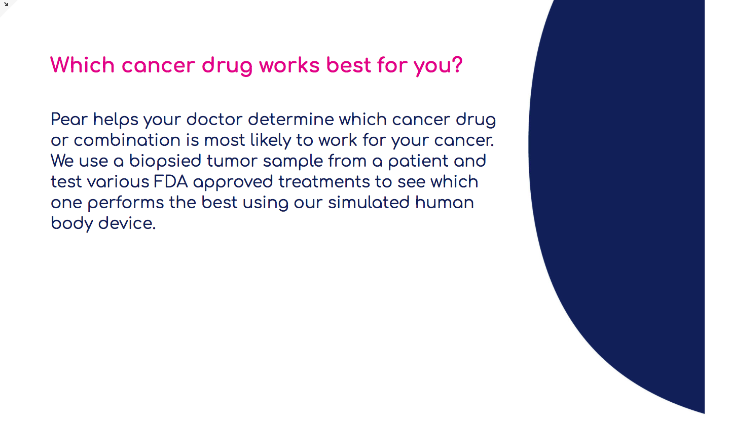
Web surfaces carrying the identity into the product experience.
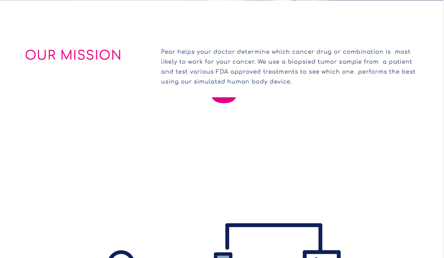
06 · The Website, Continued
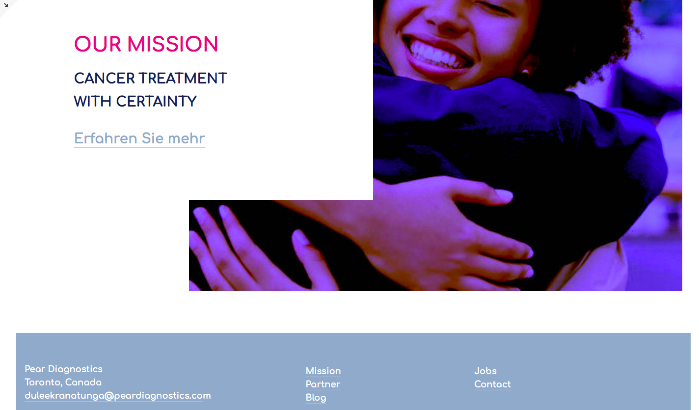
The full page
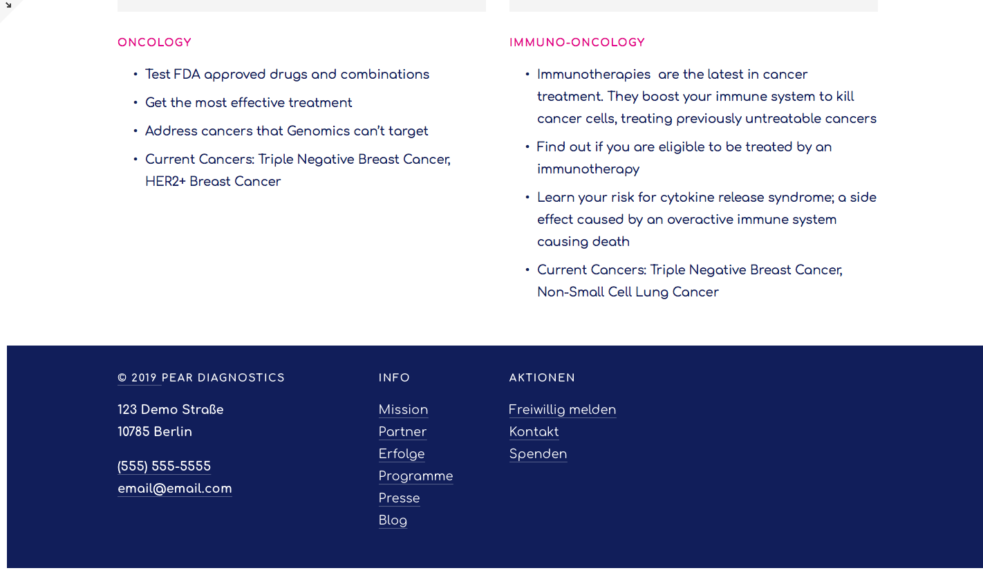
More web surfaces — the identity holding up across the site.