Case Study · Branding & Visual Design
Keeta
A brand and visual identity for Keeta, the network layer for modern global finance. Research-led art direction turned into a confident, product-ready system for a payments company moving money at the speed of the internet.
My role
Tools
Keeta is a payments network built to unify modern global finance — connecting traditional banking and blockchain on a single layer, with cross-border settlement in milliseconds. The brand had to carry that ambition: precise, engineered and unmistakably modern, the moment a user opens the app.
The work started with research — mapping the payments category, the audience and the trust a money product has to earn. From that came the art direction: a clean, high-contrast visual system built around strong colour, confident type and graphic shapes that read instantly at every scale.
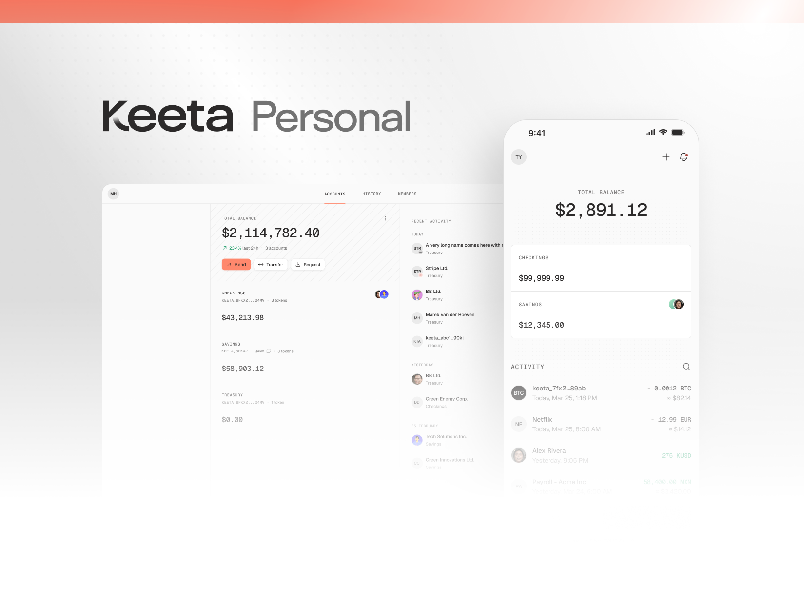
The result is a brand that works on both sides of the glass: the product UI that institutions and customers use every day, and the campaign work that tells the story around it. Here are the research boards, the style frames, and the product surfaces that carry it all.
01 · Research
The thinking before the look
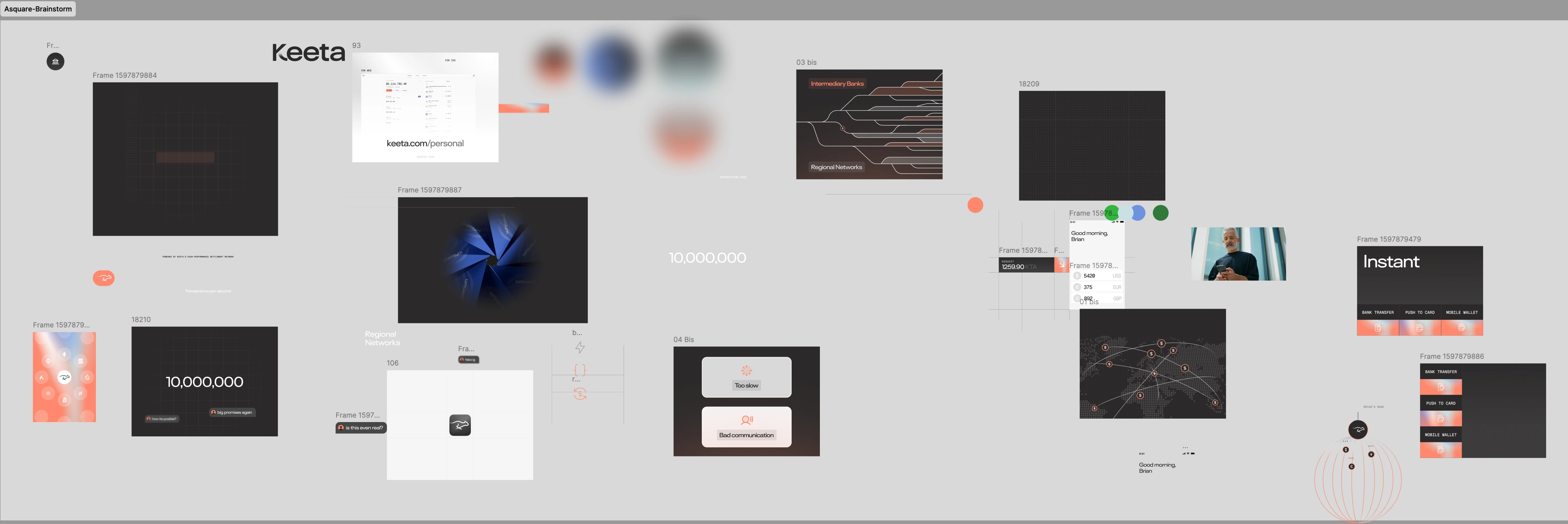
The visual direction came out of research, not mood. Mapping the payments category, the audience and the trust a money product has to earn — before a single style frame was drawn.
02 · The Look
A keyframe that locks the whole system
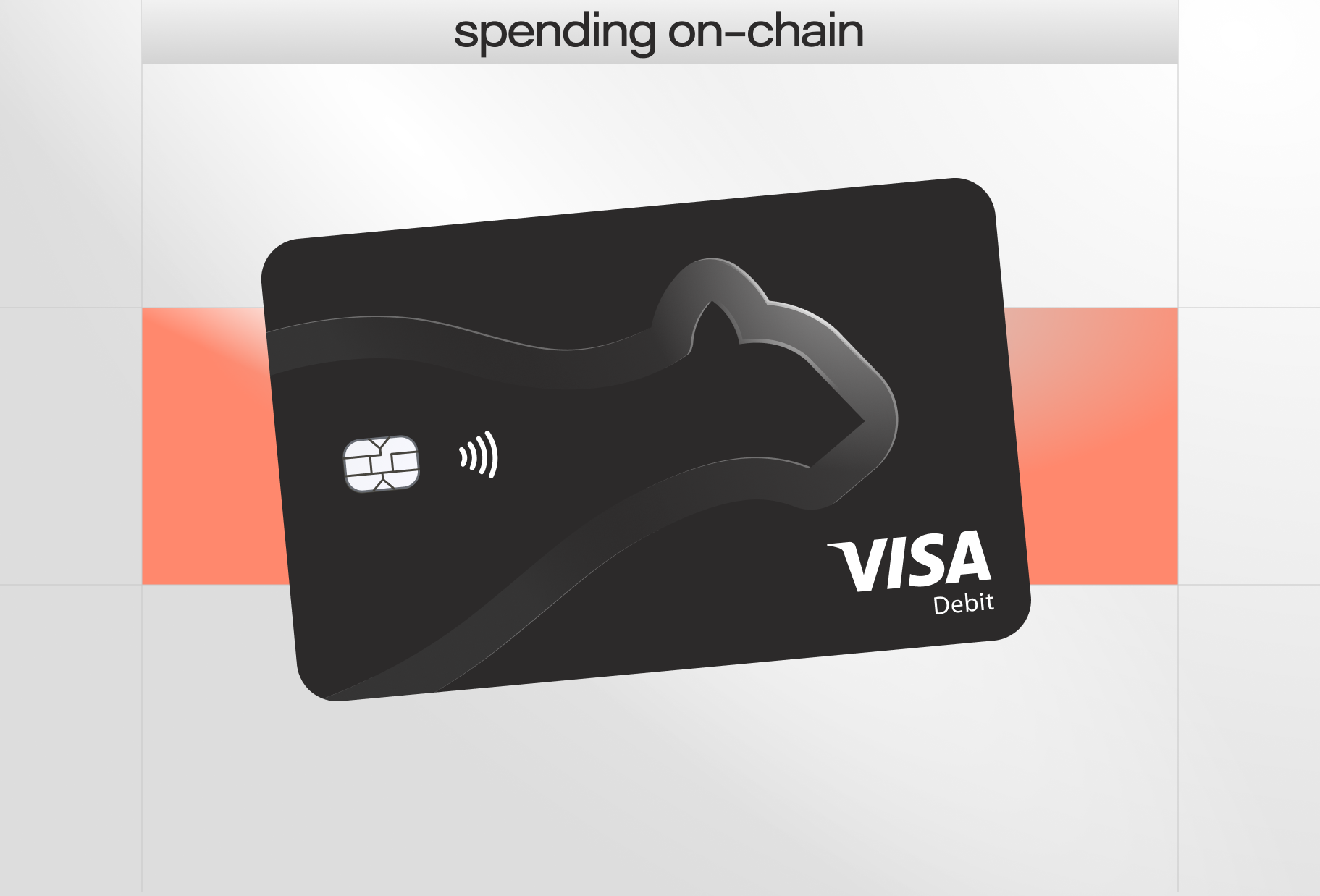
One frame was built to carry the entire direction: the colour logic, the type energy and the graphic shape language. Everything that followed — app surfaces, campaigns, motion — stays inside that system.
03 · Style Frames
Style frames that carry the whole system
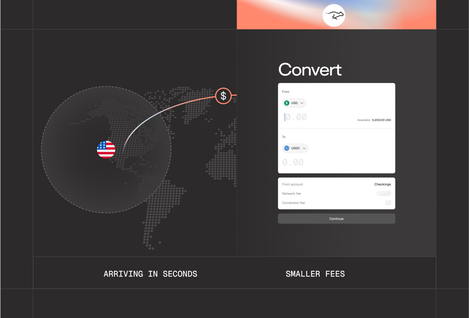
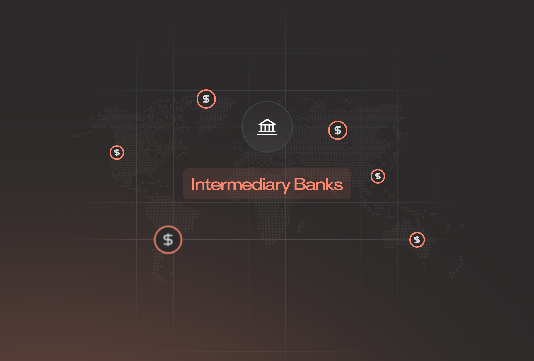
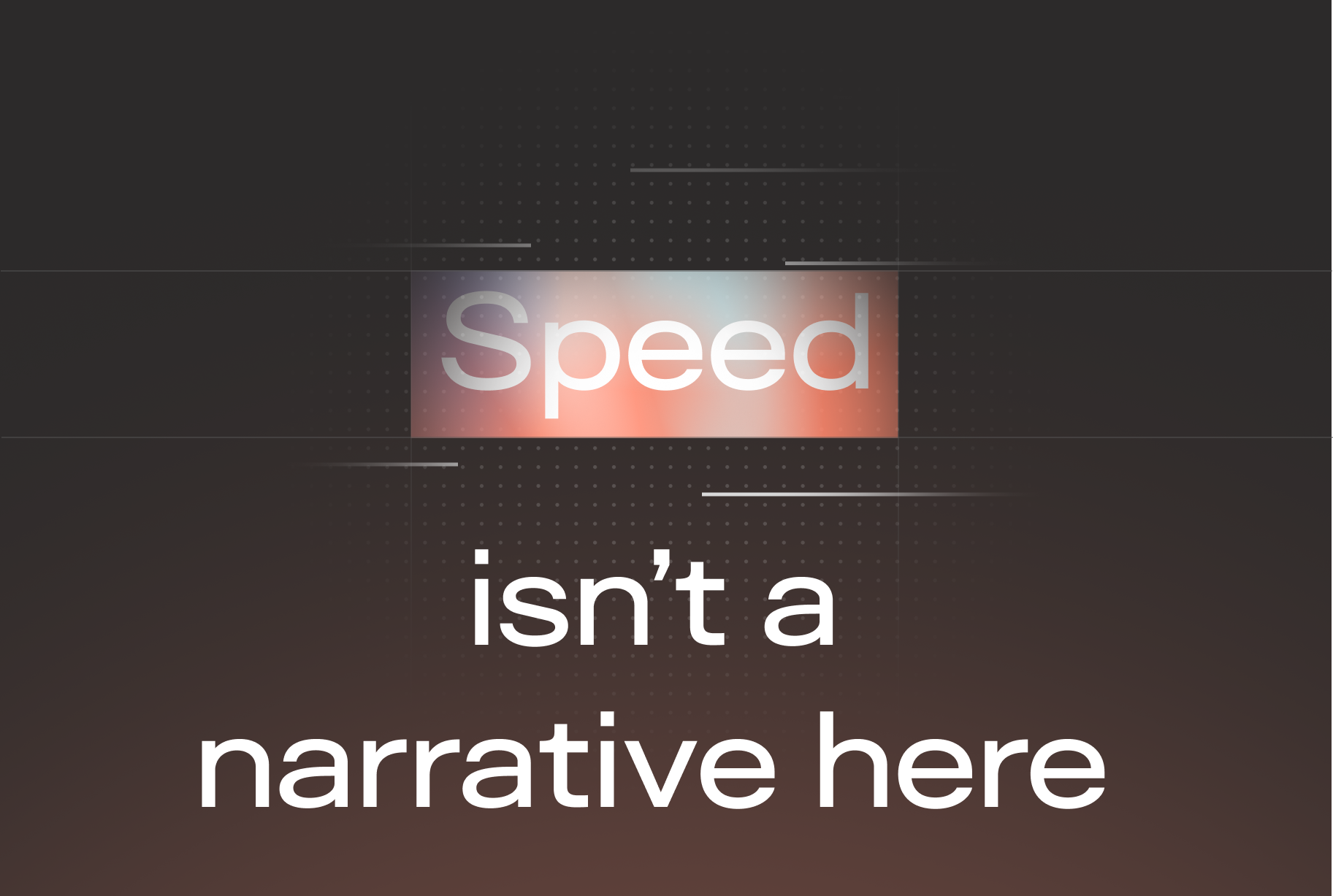
Style frames refined the system frame by frame: layout rules, colour distribution and how the graphics hold up on screen — before any of it reached the product.

04 · Product Surfaces
The brand where it lives
The system translated into the product surface itself — the app UI institutions and customers use every day. The visual language stays consistent from campaign to screen, without losing any of its energy.